
An example of a UI/UX design improvement I did on a mechanical slot game configuration page.
The before..

And the after.

The quick version: The functionality offered by the older page was limited and created unnecessarily long workflows for some cabinet service calls. So I added a visual representation of the reels that should be showing on their mechanical counterpart. You could also now tap the reel segments in order to test the bulbs, and could also now spin individual reels.
The changes received a lot of positive feedback from service personnel and this improvement saved over $100,000 in labor hour costs through quicker workflow.
That’s the gist. If you want more detail, read on!
In Great Detail version: While digging through one of my digital junk drawers, I came across a couple of screenshots from probably 15 years ago. It’s a before and after of a configuration/diagnostic screen for the mechanical portion of a mechanical/video hybrid slot game of the era.
You can see the second version of the screen has a lot more going on.
So to understand if the new version was better or not, you’d need to understand what the people using this screen were doing.
Mechanical reel games, when they are first built, or whenever they received game or art changes, would need to be checked that the art strips mounted on the reels matched what the software was expecting them to display. After my change, the screen allowed them to do that visually at just a glance.
Once you know the artwork is correct, the tech needs to make sure they line up nice and centered on the payline. The numbers on the screen here indicate the step and the symbol of the stop point of the reel. If the reel was off by a bit, the tech had to:
– Shut the game down
– Physically remove the reel from the cabinet
– Slide a metal tab up or down the reel a little bit
– Reinstall the reel
– Boot the game back up
– Get back to the config page
And it might take doing this a few times to get it lined up perfectly. And these folks did not settle for less than perfect.

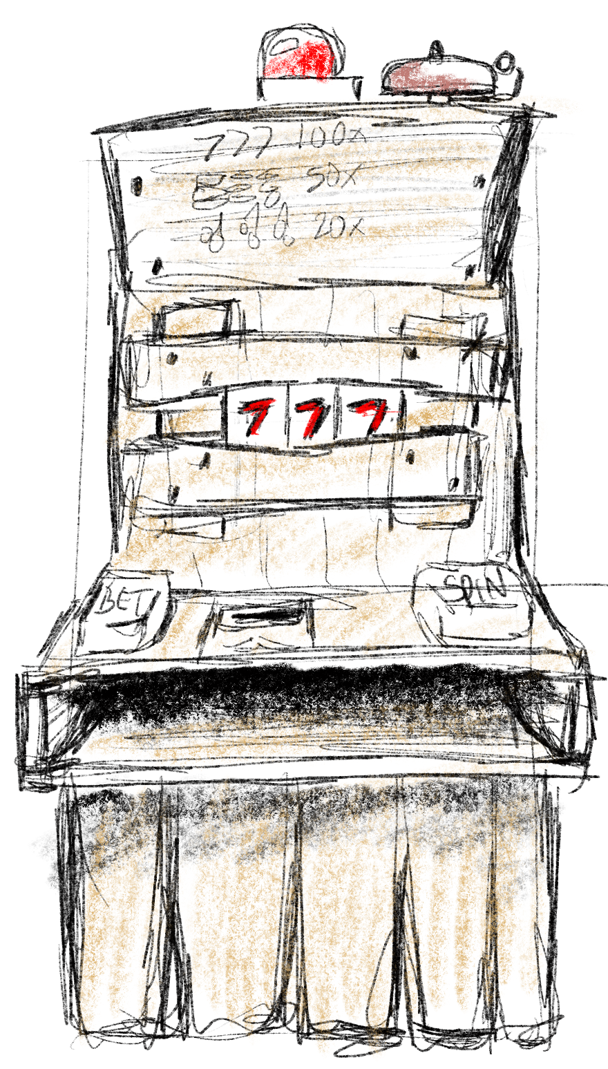
This is what AI thinks the inside of a slot cabinet looks like.
In what I thought was a clever approach to this, I added a driver-level soft offset that could be applied to the spun reel position, that would be stored in the machine’s non-volatile memory so that it was preserved between boots. The tech could now bump the reel a few steps in either direction and save that offset to memory, and no longer needed to disassemble the reels for adjustment unless they were seriously off. A huge timesaver! This was all on another screen (accessed through the new “Reel Diagnostics” button on my revised screen) that I whipped up but, unfortunately, did not save a screenshot of all those years ago.
Back to the screenshots here, there’s also a row of buttons that cycle through a spin up, spin down, and hold states so that when a test spin is applied, the function of the reels under specific behaviors can be checked.
There was some dynamicness to the page layout.. depending on the type of reel equipment attached to the cabinet the number of reels showing, or the statuses available, or even some commands to send the reels would be different.
These were coded in Flash and ActionScript 2.0 on the frontend, and changes in the underlying C++ platform. I kind of stretched and reshaped existing graphical assets into their new positions in MS Paint.
The original screen was literally just a page that exposed the interface between the game and the reels. It was built by and for software engineers to troubleshoot with.
The revised screen was reshaped for the user experience of different users. At this point of the product’s lifecycle, it wasn’t software engineers using the page anymore, it was field technicians! Changing the user experience to make the workflows easier was as simple as asking “who” and “why”, looking at those workflows, and removing any friction found in those workflows caused by the UI.
How would I approach it now, with the lens of added experience, new tools, and current trends in UI/UX?
The biggest limitations here is the underlying tech, but there were some other constraints:
- The reel controller designs were in-house, and a lot of reel functionality was coded directly into the controllers.
- ActionScript and Flash is clunky, has a rough development pipeline, doesn’t offer much built-in UI and certainly nothing modern.
- I was only changing this screen. I couldn’t diverge too greatly from the rest of the configuration screen design precedent.
- The screen still had to be navigable solely from the hardware button deck, which a lot of times is three buttons: next, back, and select. Adding too much to the screen makes it cumbersome if you don’t have a touchscreen, which a lot of games on this platform did not.
I would try to use the screen space a little better, taking cues from mobile app design. Smartphones had only just come about; I think I had the original iPhone right around the time that I did this project. The screen size on the mechanical cabinets was often a 5 inch screen.
Redistributing the various function buttons to around the edge of the screen with the reels in the center would be a concept I’d play around with.
In closing…
Looking back, I feel lucky I got to do this in this manner. I got to handle every bit of the vertical including talking to the users before and after, and that was rare in all but the smallest companies I’ve worked for. It’s especially satisfying when your change has such a measurable impact on quality of life for downstream folks, the quality of the product, and a significant cost-savings for the company!

Leave a Reply